
- C L I E N T -
miboso
- P R O J E C T -
Rebuilding Trust in Holistic Wellness
Re-Branding, Brand Story, Brand Positioning, Brand Identity, UI
|

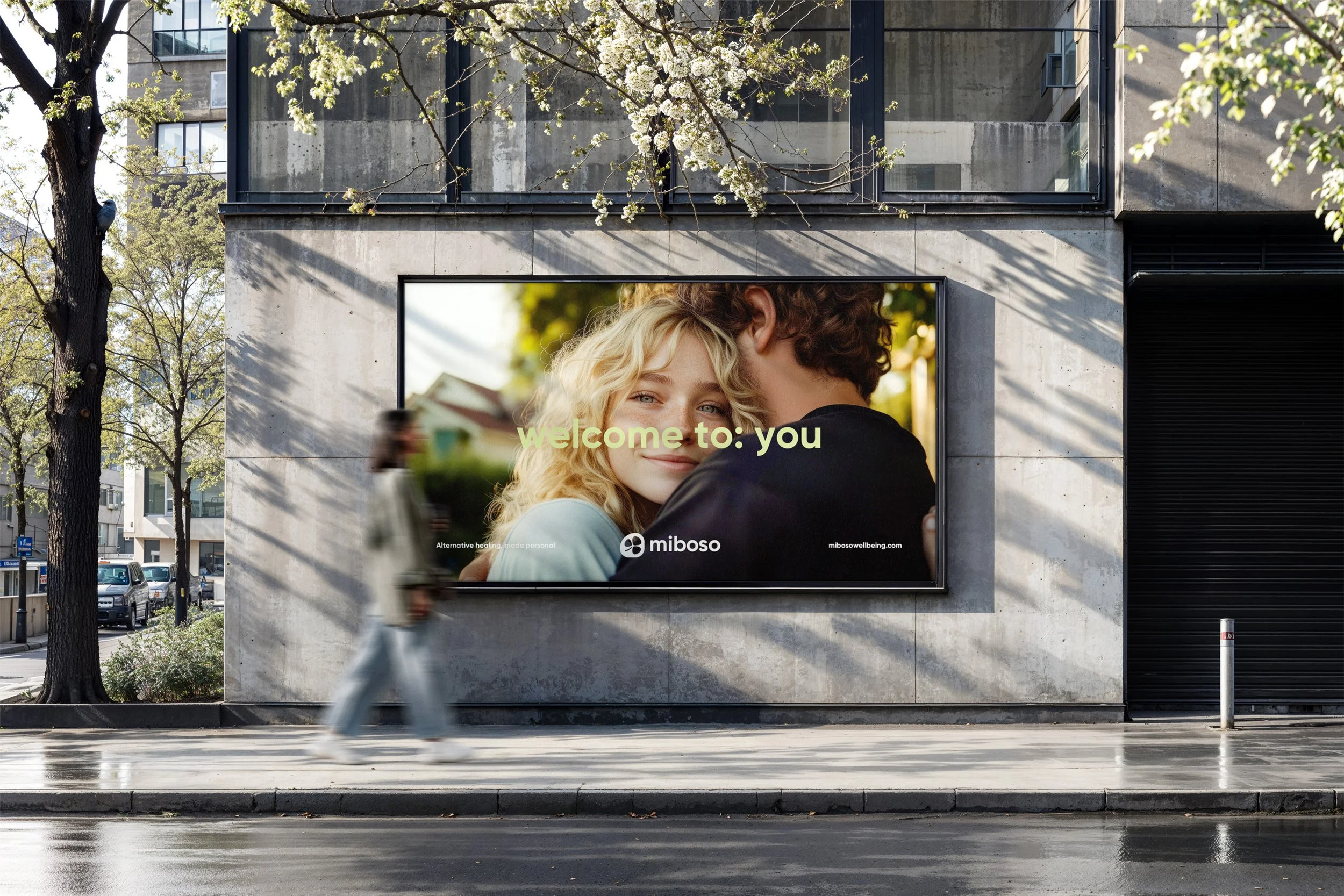
alternative care, made personal
The
Project
Miboso came to us with a set goal and a clear strength — a name and concept rooted in the connection between mind, body, and soul — but their existing brand was sending the wrong signals. Originally positioned with a luxury, high-touch aesthetic, the brand had unintentionally created a barrier: it felt exclusive, unattainable, and distant to the very people they hoped to reach.
They weren’t just looking for a rebrand. They were looking for a realignment.
We worked closely with their team to reshape Miboso into a platform that still holds integrity and depth, but now feels warm, inclusive, and grounded. We helped define a brand strategy that prioritized accessibility over aspiration, without losing soul. From positioning to voice, from visual identity to user experience, every element was reimagined to say: “Wellness belongs to everyone.”
The result is a brand that invites curiosity, not comparison. A tone of voice that speaks plainly but purposefully. A visual system that feels modern and welcoming, rooted in softness and subtle symbolism.
At its core, the new Miboso is more than a marketplace for healing — it’s a platform that meets people where they are, and reminds them they belong.

The Name
A name that feel familiar, suggests balance, interconnectedness, rhythm, and completeness. In its lowercase form it is modern, accessible and feels human.
miboso = mi (mind) + bo (body) + so (soul)

Brand Identity
gentle, ancestral, quietly wise
Before medicine had systems and codes, healing lived in the body. The clover is not a symbol of luck here — it’s a reminder. That wholeness isn’t something we create. It’s something we remember.

Brand Colors
The Miboso color palette was crafted to soften the brand’s previously exclusive tone and invite a broader, more diverse audience into its world. Rooted greens convey trust, grounding, and connection to nature, while the fresh green-yellow brings warmth and approachability. Soft off-whites create a breathable, calming backdrop, and the airy lavender adds a gentle emotional layer without feeling overly feminine. Together, these tones balance modernity and soulfulness — helping Miboso feel more inclusive, nurturing, and attuned to everyday seekers of wellness.
